Ki-dish
FOCUSES: Brand Identity, Packaging, Type Design, Illustration, Copy Write
Tasked with designing a restaurant brand that can survive in a COVID-19 world. The goal for this brand is to feature a new country every month, and this month is featuring the country Greece! Dining out is not an option all the time, which is a significant problem for working and non-working parents alike. Using a kit box, parents can help expose their kids to different kinds of food while at the same time learning about the culture it comes from.
Logo + Illustration Style:
The logo uses many playful hand-made types that I created in Adobe Illustrator and used an extra mark to bring the logo more personality with a smile. I also created a pattern that I use throughout my branding of Kid-dish. I also use three kid mascots, being mindful of making them a diverse group of kids to cater to a broad audience.
Brand Direction:
Kid-dish is directed to educate kids about different cultures with a monthly Kit-box alongside a food order. I created the brand to feel kid-friendly and playful with illustrations and a hand-done logotype. The brand look and feel contains a lot of playful color choices and illustrations to make it feel very kid-friendly but at the same time educational.
Deliverables
The Ki-dish Kit box comes with educational and fun souvenir for little explorers. Including t-shirts, buttons, a geographical poster, crayons, and an educational activity book.
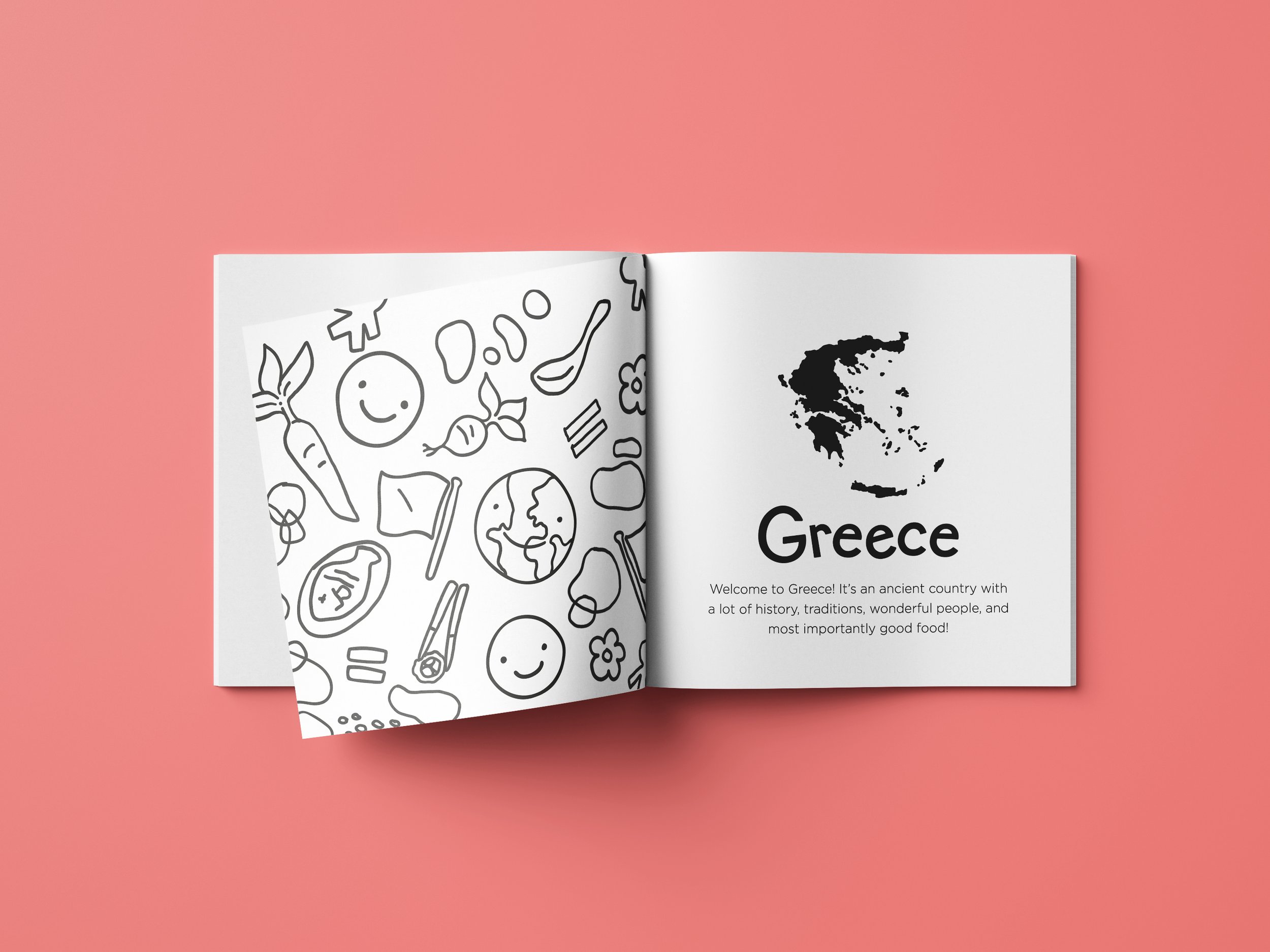
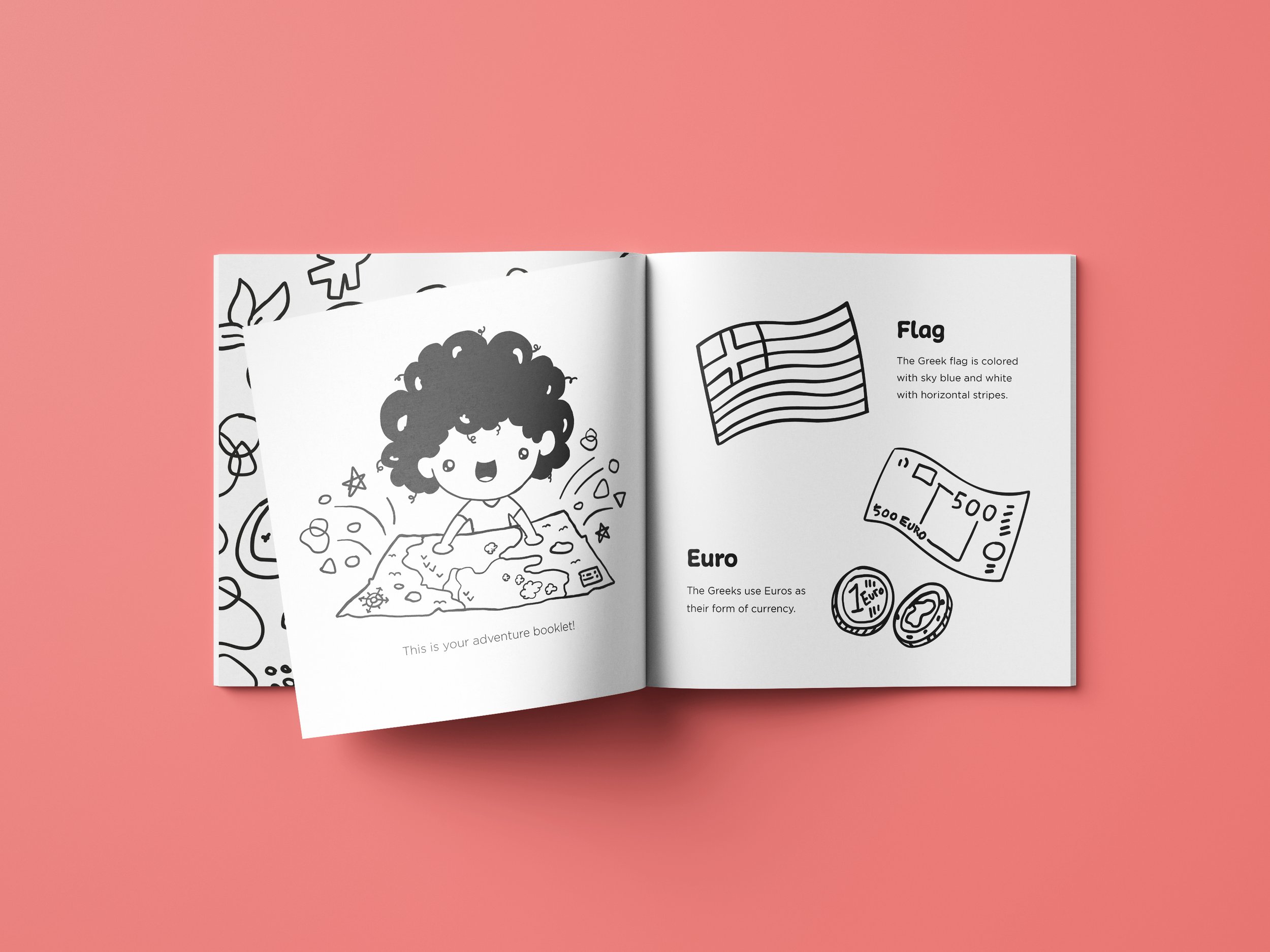
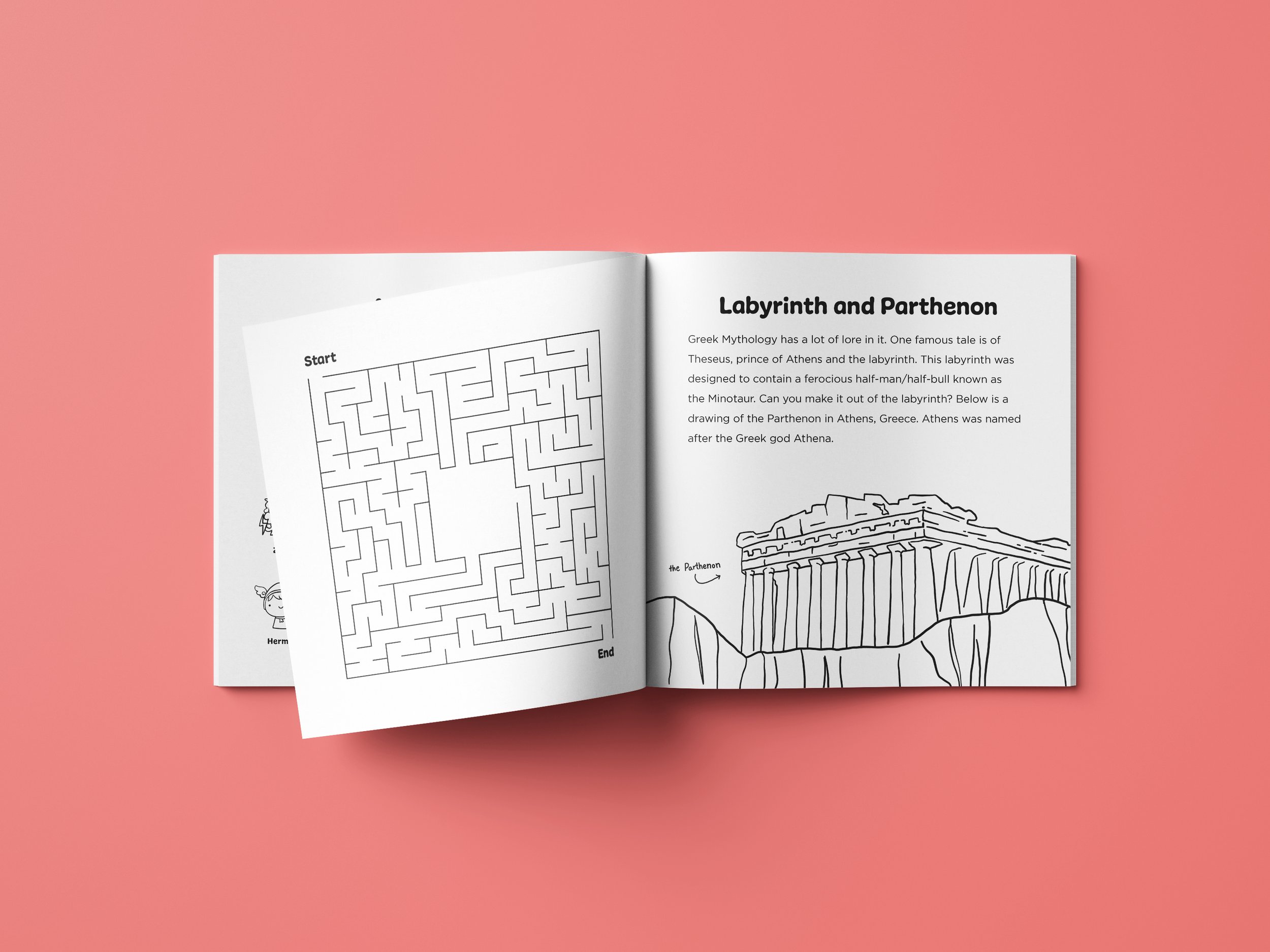
The activity book is acts as a coloring book as well. Filled with educational content about the country Greece for kids to read while having fun activities integrated. The activity book took a lot of planning and research to make.


For the website, I wanted to continue with my playful color and pattern usage. Using the tag-line “Lets Eat and Learn Together” to engage with one of the targeted audiences, the parents.


